Custom dispenser: make your beer stand out in every bar
At Aplimet we have been designing and manufacturing beer dispensers for 20 years. Over this time, we have learned to adapt to client needs and move with the times. As design is dependent on the moment and the context, versatility is one of the main traits that has allowed us to spend two decades doing what we do.
Design and customisation
Design permeates our lives. Practically everything we set our eyes on has been designed for a particular purpose: from something as generic as a city to something as specific as a bar or, even more so, a beer dispenser.
Designs respond to different needs depending on what one wishes to achieve through them. Yet when the ultimate aim is to tell a specific story or narrative, design must do more and be created specifically to tell that story. This type of design is customisation, and is exactly what we do at Ideliq, the Aplimet brand which specialises in capturing a brand’s essence in its dispensers.
The pillars of design
If we are speaking about design in a broad sense, we could study hundreds of very specific factors that play important roles as regards the final result. However, we are going to focus on three areas which encompass a large part of the effectiveness of every design: colour, shape, and semiotics.
Colour
«Colours, like features, follow the changes of the emotions».
– Pablo Picasso.
Colour has been keenly studied from various perspectives and disciplines throughout history. We could get technical and look at the various different wavelengths but design – and customisation in particular – is grounded in emotions.
As Picasso noted, colours vary depending on who views them and how they do so. However, there are certain cultural consensuses which give us an idea of the emotions that each pigment will evoke in most people. Colours are usually split into three main categories: warm, cold, and neutral.
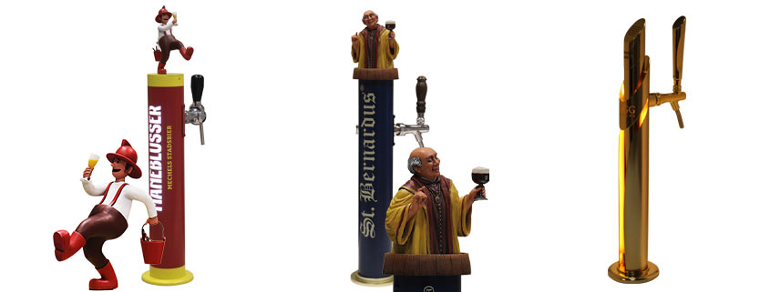
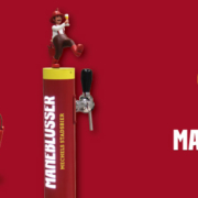
- Warm: Intensity, passion, strong emotions, hope. Warm tones conjure up energy and proactiveness. Accordingly, they are perfect for narratives which seek to make physical activity or emotionality part of their tale.
In our case, a good example would be the custom dispenser we created for Maneblusser, a Belgian beer with a fun story to tell.
- Cold: Vastness, calm, infinity, nature. The colours of the sea, sky, and nature bring to mind peacefulness and vastness. They are serious, elegant colours which convey confidence.
At Ideliq, one of our designs which uses cold tones is the dispenser for the St. Bernardus brand. The dark blue evokes the scale of the beer, the history of its recipe, and the grandeur of its origin.
- Neutral: Seriousness, peacefulness, balance, mystery. White, black, and their combinations – grey tones – suggest neutrality, flexibility, and formality.
One of our designs in this style is the dispenser we made for Åbro, a Swedish beer brand whose story centres on Scandinavian values and the purity of the water they use in their recipe.
Form
«There can be no contradiction between beauty and utility: an object is beautiful from the moment its form becomes the manifest expression of its function».
—Paul Souriau.
The eternal battle between form and function: which is more important?
In a good design, as Paul Souriau stated, form and function are always linked. Aesthetics cannot be ignored as there are many ways to obtain a functional product. It therefore must be distinctive from a sensorial point of view, to arouse emotion by means of its design, for which form is to a large extent responsible. Nor can function be ignored. A product with a ground-breaking, interesting, captivating, and eye-catching aesthetic is worthless if it does not work.
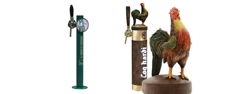
When it comes to shapes, the secret lies neither in sobriety nor technical skill, but rather in balance. The key is to give each dispenser the form that its tale requires. Extravagance, whilst eye-catching, does not necessarily aid the narrative a brand wishes to communicate through its design. A clear example from our catalogue is the dispenser we made for LA SAGRA, a client from Toledo, Spain. This brand does not need to be ostentatious or loud because its greatest value is their adherence to a traditional recipe and use of natural ingredients and processes.
Some clients, however, do need to pay close attention to every detail in order to tell a story through their design. Using form to highlight this tale is the key to making them stand out. An example of this from among our projects would be the dispenser we made for Coq Hardi, a beer with a story which is closely linked to wood. Accordingly, we drew upon special resins to create a wooden aesthetic which communicated clearly this important element in the Belgian brewery’s story.
Semiotics
«A tool which, when correctly applied, has incalculable communicational value”.
—Maria Alejandra Wuetter
This is a somewhat complicated concept, so we will only focus on what concerns us in this article. Semiotics is directly linked to the meaning of objects and the symbols which represent them. To give an example: regardless of the form of a traffic light, if we see that it is red, we know we must stop. Therefore, the colour red in traffic lights signifies that crossing is prohibited.
We are surrounded by symbols which we are constantly interpreting, or not. The meaning these referents take on is very much linked to the collective imagination of each culture. That is why it is difficult to create a generic referent which means the same thing for everyone. It is precisely for this reason that semiotics and referents are a difficult but extremely interesting challenge when it comes to designing and customising.
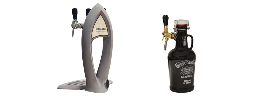
In our case, two examples would be Tre Fontane and Grevensteiner.
- Tre Fontane: In the world of beer, Trappist origins are highly valued. Only a small number of brands hold a certification of authenticity and the only Italian brewery to possess it is our client. For this reason, evoking the monastic, classic origin of the beer was absolutely essential. Accordingly, the dispenser portrays one of the arches from the monastery where the beer was created, the Abbazia delle Tre Fontane.
- Grevensteiner: This German beer has been in the hands of the same family for five generations and is about to reach the milestone of its 200th anniversary. To unite in a single item its German origin, its age, and its recipe, Ideliq reinterpreted the model of the Steinie bottle, a classic for the brand as well as for other German wheat beers from the previous century.
Customisation and its unlimited potential
After this brief overview of design and customisation, we want to stress that the possibilities offered by a design are limitless. There is no story which cannot be told through design and this is what we do at Ideliq: find, understand, and express the essence of a beer brand on its custom dispenser.
We help you portray the soul of your brand in your tap through colour, form, semiotics and all the elements that emotional design and customisation involve. This means the soul of your brand will be represented at the bar, to boost consumers’ feeling of belonging and emotional ties to your brand. In short, to make them brand super fans.
Do you want a custom dispenser for your brand?
Fill out this form and we will contact you.
Or call us at (+34) 93 565 01 63 and our customer service department will be happy to answer all your questions.
For more information: info@aplimet.es



 ISO 9001:2015 Certificate
 Quality Policy
